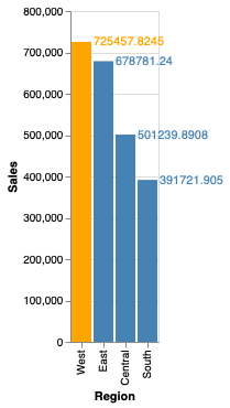
Рисую простую диаграмму на Python
Вот собственно сам код:
import pandas as pd
import altair as alt

df = pd.read_excel('Sample - Superstore.xls', index_col=0)
df2 = df.groupby('Region').sum()
df2 = df2.reset_index(level=0)

bars = alt.Chart(df2).mark_bar().encode(
   alt.X('Region:N', sort='-y'),
   alt.Y('Sales:Q'),
   color=alt.condition(  alt.datum.Region == 'West',  # If the year is 1810 this test returns True,
   alt.value('orange'),     # which sets the bar orange.
   alt.value('steelblue'))
)

text = bars.mark_text(
    align='left',
    baseline='middle',
    dx=11  # Nudges text to right so it doesn't appear on top of the bar
).encode(
    text='mean(Sales):Q'
)

(bars + text).properties(height=300)